NANCY SIMONDS: SHAPE SHIFTING & RADIANT CHROMA

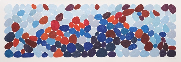
Nancy Simonds, Red and Blue Cadence, gouache on paper, 21 x 53″. Photo: Nathan Evans Photography, 2015.
Nancy Simonds is a colorist whose paintings suggest the chromatic feel of the natural landscape in which the sky plays a major role. The white surfaces of Simonds’ gouache paintings on paper become situational atmospheres, or skies, seen behind or beyond.The paper takes on a quiet depth, toned by the colors it supports—colors that become active figures relieving the white surface of its neutrality.
Red and Blue Cadence is a wide expanse of clustered, organic flat shapes that shift from deep crimsons, oranges and blues to paler variations that recede to the whiteness of the paper. Where colors are darkest the white space around them is brightest.Toward the top of the space, paler colors suggest a tonal fading, making the white space feel slightly cloudy even though the white is actually unchanged. To put it another way, Simonds’ colors create weather, a weather in which visual relationships shift as strange energies through which optical narratives emerge.
Centered 9×9 Block III, a set of nine square papers each with a square within a square in primary and secondary colors, confines the white of the paper to the borders, somewhat tamping down the white while intensifying the colors. Centered 9×9 Black III also reveals another feature of color painting, a kind of alternate sensation—flavor. Simonds’ color range can be slightly burnt and savory in the intense end of her spectrum, unlike the cool sweetness at the paler extremes of Red and Blue Cadence. When color pushes sensory experience beyond visual signals it begins to behave metaphorically, as though becoming another kind of expressive property.
Simonds is working her spaces through different, visually dynamic settings. Radiate with Two Reds is a series of thin, blade-like forms centering to form a spinner that agitates the white negative spaces. Color is also incidental in paintings like Shoal I that organize the blades in pairs that seem to float on a white, humming surface of billowing and buoyant energy. It appears that as colored shapes become more activated in the space, the less they manifest color as a primary force.