Chromatic Celebrations
by Anna Buckley
Methods of painting and printing collide in Emily Mason’s exhibit, Chromatic Celebrations, at Mitchell Giddings Fine Arts, on view now through August 16. The presentation is transitional, moving from technique to technique—thus hinting at Mason’s media repertoire. The common thread is color while the variable is process.
Four main labels describe the prints in the exhibit—GTW, LM, HG and JS.
The letters “GTW” denote the monotypes from the Garner Tullis Workshop that Mason attended in Santa Barbara in 1987. The artist used a top-down impression plate rather than rollers, preserving the extemporaneity of her original paintings within the reproduced prints.
Works marked “LM” sprang from an ongoing collaboration with painter Lisa Mackie. The pair experimented with chine collé and the silk collagraph matrix, resulting in the interplay between texture and color that is indicative of this period in Mason’s work.
Those with “HG” (meaning hand graphics) come from a workshop in Santa Fe that Mason attended in 1993. Strokes of the brush and sweeps of the roller are hinted at in this work, illuminating the experimental quality of this collection of prints.
Finally, the “JS” notations indicate a body of work that began in 1987 when Mason met Janis Stemmerman, who taught her the technique of carborundum printing. This plexiglass plate system allowed Mason to mold, reform and adjust her initial intentions as she produced the work, resulting in some of her most spontaneous-seeming products.
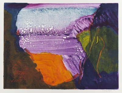
Mason’s piece Sprinkler, 1993, is fittingly named—the vivid canvas of oranges, purples, yellows and blues is ornamented with white splatters that disrupt the smoothness of the image. Dark encroaches upon light, adding movement. Color and form is emphasized in this abstract painting, evoking a sense of tension.
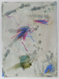
Flight, 1987, vastly differs from Sprinkler in technique, presentation and whimsy. Rather than a blend of color, Flight loosely depicts a scene—which one might interpret as insects in flight. Blues, pinks, greens and mustards make up four dragonfly-like creatures, while dots and blobs of pale grey and faded blue add motion throughout the frame, thus insinuating flight.
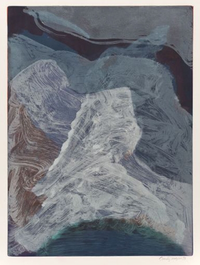
Yet another of Mason’s methods is demonstrated with Northern Coast, 1993. This painting is more natural, more ethereal. Repetition of hue and shape adds a quality of wilderness to the image, while the color palette remains muted and somber. The white shape at the forefront of the painting is cloudlike, the brushstrokes like the edges of a frothy cumulonimbus formation.
Due to the setup of the exhibit and divisiveness of Mason’s different experimental periods, Chromatic Celebrations reveals the versatility and process of an American abstract artist’s vibrant portfolio.
________________________________________________________________________________________________
Image Credit: Images courtesy of Mitchell Giddings Fine Art.
________________________________________________________________________________________________
Anna Buckley is an editorial intern for New Venture Media Group and a senior writing, literature, and publishing major at Emerson College.


