Just Happy to Be Here!
by Robert Moeller
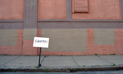
All images by Pat Falco are Untitled, 2013. Above: Photograph of installation, C Street, South Boston, MA.
Pat Falco is an artist from Boston, the self-proclaimed “Master of Light and Shadow” and regarded by many of today’s finest art critics as “Who?” On a more serious note, Pat was selected for the 2013 deCordova Biennial, which runs through April 13, 2014; he was part of the 2013 Fountain Art Fair in New York; and was one of six artists nominated for the best artist category by The Phoenix. The title of this column is borrowed from Falco’s late-summer exhibition at Montserrat College of Art. We spoke recently. —RM
Robert Moeller: In talking about your work, a familiar jumping-off point might include an artist like Barry McGee. Is that an apt comparison?
Pat Falco: Definitely. Barry, [the late] Margaret Kilgallen and many more of those West Coast artists have had a large influence on my work. I’m really attracted to that DIY culture and sort of anti-traditional way of showing artwork. In school [BFA, Mass College of Art and Design] I got so exhausted looking at most of the art we were being exposed to, but when I came across their work it was refreshing, it felt so honest and genuine so I was really attracted to it.
RM: What makes work like McGee’s accessible? I’m curious, why is it easier to find a way into a piece by McGee, say, than something presented along more traditional lines?
PF: I think through his use of public space, putting artwork outside of a gallery or a museum setting, you get a more broad demographic. It allows the work to exist more without even having to consider it “art,” it’s just something that’s there and people can love it, hate it, or ignore it. It acts as a gateway for the work “inside,” and I think helps bridge the gap for people that aren’t normally looking at art. Art presented traditionally felt so foreign to me growing up. Galleries came off as being about selling November/December 2013 Art New England 103 art, and if you couldn’t afford it then you shouldn’t be looking at it, and museums were too expensive. I know now a lot of that was just bad galleries and bad art I was experiencing, and obviously my thinking has changed on that—but I’ve still tried to present my art in a way that can be accessed by anyone.

Photograph of installation, Prospect Hill Park, Waltham, MA.
RM: Is there a danger that this sort of broad-based messaging that you describe can be misconstrued? Is it possible to create things that hold such wide appeal?
PF: Yeah there’s definitely a danger; I struggle with that and I’m still trying to figure out how my message is defined. I can’t control how people interpret my work or who exactly is looking at it, but if I’m focusing everything on what I can control—the work, presentation, and the context—then once it goes beyond me I feel I don’t need to worry about that as much. I think it’s possible to create things with a wide appeal but it depends how “wide” you want it to be. My work kind of spawns out of everyday life and interactions, common phrases, and is usually humorous, so it has the potential to appeal to a broader audience than if I was dealing with more specific things.
RM: There’s this sense I get looking at your work that there is an element of portraiture present in it. Not a rendering of an individual likeness, but rather a harvesting of moments that adds up to an individual perception of how the world feels and works, and sometimes doesn’t work. A cataloguing of things, perhaps?
PF: Yes, especially when they’re together. I guess I started in portraits, and they were so weird looking and humorous that I started bringing in the text to help tell a joke or a nar-rative. It kind of evolved from there and the work is very different now, but that’s where it started, and I think it still possesses many of the same qualities. The work tends to be very reactive to interactions or situations, so without those it doesn’t exist. I hope this makes the work feel more inclusive and like a catalogue of a personality or a kind of abstract portrait.
RM: I like, too, the build out of various pieces and the incorporation of text in the work, that, as well as having humor, is a key component. The jokes are soft and ironic, not biting. Is that intentional?
PF: Yes, it’s intentional; I don’t want to have just a bunch of “jokes” on a wall. I really like subtlety in humor or the absence of a joke where there should be one. I’m not sure how successful I am at that, but I think presenting the work together helps resolve it from being a series of single jokes or anything too assertive individually.

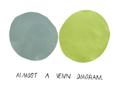
Acrylic on paper, 14 x 18″

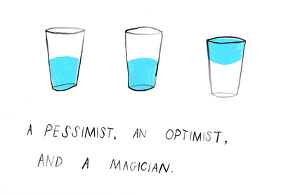
Acrylic on paper, 11 x 14″
RM: Finally, I’m curious about how you work. How mindful of groupings are you as you’re making an individual piece? Is there a plan in place beforehand, or is there an organic order that presents itself as a body of work is completed?
PF: That’s a good question and I don’t think I have a definitive answer. I don’t consider exactly how individual works will fit into a group while I’m making them; I want them to work on their own. But I do try and be aware of common themes, colors, and imagery so it will work once it’s in the group. I try to come up with a concept for the groupings before I make all the work so I can be working “towards” something. Once I’m hanging the work, everything kind of changes—I end up leaving a lot of work out or not being happy with certain pieces, and it usually results in me cutting work (literally) to fit in, or repainting and making new work as I’m installing. It’s a fun process and it makes me feel like even if I have 200 pieces of artwork done it’s not complete until it’s hung and all together.

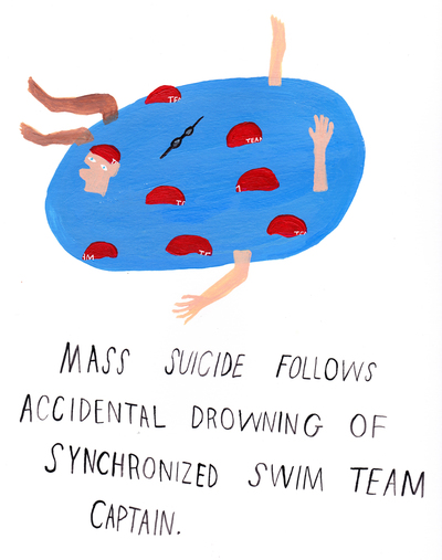
Acrylic on paper, 11 x 14″
Robert Moeller is the website coordinator for Art New England.

