From the Publisher – May 2023
Rebirth
Colors of the earth,
Knitted together
Skin, a shared canvas.
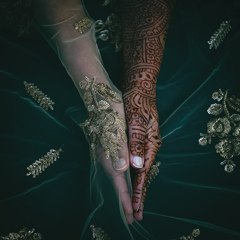
I am so moved by this cover image, Dressing Up, Dressing Down by photographer/neurologist Dr. Rohina Hoffman. And by the spontaneous haiku that Hoffman created for this letter. Without knowing what I was hoping to convey here, she tapped into my thinking.
The news has been difficult this week. Gun violence is raging across the country. A young Black boy is shot for ringing the wrong doorbell. We do not act like a country whose colors are “knitted together.” We are not regarding our skin as “a shared canvas.” We are not collectively celebrating the colors of our earth. What if we were? What if there was a place where we could? It would be a museum.
Art New England’s May/June issue celebrates museums—everything they stand for and everyone behind the scenes who helps fill them with fascinating things like roller coasters (at MASS MoCA, page 73), an increased acquisitions budget for underrepresented artists (at RISD, page 46), a gutsy, dedicated, 100% volunteer staff (at Rochester Museum of Art, page 34) improved accessibility (across the region, page 26), subway drawings (at Brattleboro Museum, page 82), Hoffman’s photographs (at The Griffin, page 54), and penguins (at The Bruce, page 50). And, of course, exceptional art and adjacent programming. This issue is designed to show how provocative, how enlightening, and how fun museums are. They have been our salvation—even more so over the last three years. We Zoomed with them when they were closed and rushed back when they re-opened. Inside a museum, the colors of the earth are knitted together. Where we are introduced to other worlds (past and present), other peoples, and sheer brilliance. They are a place where our skin is a shared canvas—and celebrated. Thank you, Museums and staff.

You may have noticed we’ve debuted a new logo—to go along with the new fonts and design refresh we introduced last issue. It’s been something we’ve been talking about for years. For me, it’s a new/old logo. I have always loved the ANE logo from the 70s. The energetic swash-swipe to the word Art. It captures the dual personality of New England—which often doesn’t know who it wants to be when it gets up in the morning. Will it be shy and conservative or bold and cosmopolitan? New England wants it both ways, always has. And that’s reflected in the art created here, from the avant-garde to the traditional. So we added back a little flare to Art and kept New England solid and steady. Thank you to Nancy Campbell and Trevett McCandliss for their design and ANE’s art director Lori Pedrick for orchestrating every aspect of both projects. Sometimes life comes full circle. Sometimes we look back for inspiration and wisdom in order to move forward. Sometimes the answers—and the logos—are right in front of us.
Hoffman’s Dressing Up, Dressing Down “is about not feeling like yourself in your own skin and examining gaze in the context of the diaspora.” We feel its beauty, its spirituality, its strength, and in that, its hopefulness. That simply being who we are will be universally accepted—one day.
If Art New England were a haiku, it would be Hoffman’s. What more can an art magazine aspire to than to be a canvas, reflecting and sharing and knitting together the colors of the earth?
In gratitude,


