Wing of Desire
The new Art of the Americas Wing at the Museum of Fine Arts, Boston, is the largest and most ambitious museum expansion and reorganization ever in New England. The architectural firm in charge is Foster + Partners, of London, which is also the hometown of MFA director Malcolm Rogers.
Lord Foster’s firm is responsible not only for arts projects such as the British Museum, but also for high profile makeovers, including Berlin’s Reichstag, and for new construction such as the Beijing International Airport, the largest building in the world.
Museum building over the past couple of decades has been notable for flamboyance: a prime example is Frank Gehry’s tornado-like titanium-clad Guggenheim Bilbao. From the outside, it’s thrilling. Inside, though, most of the galleries and shows, which tend toward loans from the parent Guggenheim Museum in New York, are disappointingly pedestrian. The intention in Boston is the opposite.

“This is not an architect’s building,” says Elliot Bostwick Davis, chair of the Art of the Americas department at the MFA. “The art is what’s driving the building.”
It is, however, obviously a Foster building, especially in its liberal use of glass, Foster’s signature material. In the British Museum, his firm’s brief was to liberate one of London’s great “lost” spaces, the Great Court of the British Museum, which hadn’t been accessible to the public for 150 years before Foster completed the project in 2000. Centered by a spectacular circular Reading Room, a structure dating from 1857, the Great Court occupies two acres in Central London. Foster’s design included covering it with a huge curved roof of 3,500 triangular panes of glass, each a different size and shape. For the MFA, he covered the huge Shapiro Courtyard—over 12,000 square feet, sixty-three feet high—with 504 large glass panels. Adjacent to the Art of the Americas Wing, the covered courtyard is now a year-round space for exhibiting sculpture, as well as housing a new café.
In the MFA’s new wing, a central glass building is flanked by pavilions made of glass and the same Deer Isle granite from Maine used in the MFA’s original Beaux Arts structure. The jury is still out on this attempt to connect new and old, but this new East Wing has got to be more successful than I.M. Pei’s disastrous 1981 West Wing, which looks like a bland shopping mall glommed onto the majestic 1909 building by Guy Lowell. (In the MFA’s reallocation of space, the West Wing reopens in 2011 as the Linde Family Wing, which will be headquarters for the museum’s contemporary collections, a fine move from a museum that until relatively recently ignored contemporary art.)
 A less publicized part of the Foster renovation is the interior rerouting of visitors. A central north-south axis, part of Lowell’s original design, has been opened up, so that the two main entrances, one on Huntington Avenue, the other on the Fenway, are connected in a straight line that is intended to be obvious to visitors, thus orienting them. The old arrangement was such a Byzantine maze that after decades of regular visits, I still got lost.
Rogers’s boldest—and most controversial—curatorial move to date was the consolidation of what had been a lot of relatively independent fiefdoms into megadepartments, including the one that Davis heads. She is in charge of a mind-boggling array of work—three millennia’s worth of art from North, Central, and South America. Her own specialty is North American painting of the nineteenth and twentieth centuries, and decorative arts. She has both staff and visiting curators who are experts in the rest. On the significance of the MFA’s American initiative, she says that as far as any groupings of arts of the Americas in the same wing go, “I can’t point to one that has the same breadth.” There are other museums that have superb and diverse American collections: New York’s Metropolitan Museum of Art, where Davis used to work, is one. Yet even the Met doesn’t have all its materials from the Americas grouped together. It’s a hefty hike to locate them all in various corners of the building.
When Davis arrived at the MFA in 2001, the perimeter of the Foster plan was a given, yet the interiors were not. She and her team, along with the architects, had to fill in the blanks. In response to visitor surveys indicating that “they expected art history to unfold in front of them,” Davis says they opted not for a layout determined by medium, a system still in effect in some other parts of the museum, but one that went along chronological lines. The new wing has four floors and the time travel starts on the lower ground level, with the oldest works, and ascends to a third floor that brings visitors up to the mid-1970s. Throughout the new wing, an air of domesticity often prevails, not only in the nine period rooms but also in galleries that combine paintings, furniture, ceramics, and silver along with architectural elements, including a large timber frame from the seventeenth-century Manning House in Ipswich.
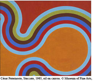
 The lower ground floor has what will read to most visitors as the most exotic works, including gold from the Andes and urns from ancient Guatemala. Reviewing the lists of objects gives a sense that while all the Americas are represented, there is, understandably, a focus on New England. This is going to be a treat for foreign visitors and also for school groups who are studying American history and culture. Among the treasures from eastern Massachusetts are period rooms such as the Brown-Pearl Hall, built in Boxford about 1704, which demonstrates the multiple uses of what today’s real estate ads would call a “great room”; colonial embroidery made by the women and girls of Boston; and John Singleton Copley’s iconic portrait of Paul Revere, shown with Revere’s own “Sons of Liberty” bowl, both from 1768. The connection continues up to the top floor, with works by Malden native Frank Stella and Gloucester’s Walker Hancock.
Even the works in the new wing from the 1970s predate the thinking and the technology in the wing’s four “Behind the Scenes” galleries. Museum education has come a long way. This quartet of interactive rooms is built on the roles of curators and conservators. It includes screens that allow you to design your own plate based on patterns from Mexican ceramics, and activity tables such as one where visitors can sort silver teapots according to changing styles. Its most important role is to make the public aware that curators and conservators are constantly making decisions, and that those decisions change with the times. When the MFA was founded, plaster casts of classical sculptures were the rule in all big institutions. Now they’re not, because they’re not the real thing. How art is conserved has also evolved. The rule now is not to do anything that can’t be undone, because in another generation, methods of cleaning and caring for works will change again. So conservators want to play it safe.
Foster’s use of glass is not only for design purposes, but also for metaphorical ones. Transparency, a word now co-opted by politicians, was, for example, important in the redesign of the Reichstag, a building that once stood for secrecy. Now people can look through layers of glass into the heart of the chamber where the Parliament of the reunited Germany meets.
At the MFA there wasn’t any transparency in the choice of Foster, which was sprung on the public by surprise, as a fait accompli, on May 17, 1999. Compare that to the public process around the same time that led to the choice of architects for Boston’s Institute of Contemporary Art. Models of the designs by the four finalists were put on view so the public had some idea of the range of possibilities, and the finalists gave public presentations.
By contrast, the building and installation of the MFA’s Art of the Americas Wing was so shrouded in secrecy that until its November 20 public opening, very few people were given even a peek. Senior curators in other departments weren’t even let in. “I like surprises,” Rogers says. Let’s hope that the new wing is a happy one.
At any rate, the MFA’s intention was to put to challenge the truism, “The largest object in a museum’s collection is its building.” If Foster’s architecture is as discreet as it’s billed to be, the largest things in the Americas Wing are such works as Thomas Sully’s The Passage of the Delaware (1819), which measures twelve feet high by seventeen feet wide, and that’s without its huge frame. The intent of the new wing seems to be that the largest objects in an art museum should be art.
_______________________________________________________________________________________________________
Christine Temin was the art and dance critic at the Boston Globe for over two decades and now writes for a variety of international publications. She has taught at Middlebury College, Wellesley College, and Harvard University. Her most recent book is Behind the Scenes at Boston Ballet, published by the University Press of Florida.
