Jeff Ostergren

Visiting Jeff Ostergren’s studio, this writer was treated to a healthy lunch made from New York Times recipes. Some of his newest paintings hung in the freestanding studio—a converted garage with pitched ceilings and replete with diffuse light—behind his New Haven home.
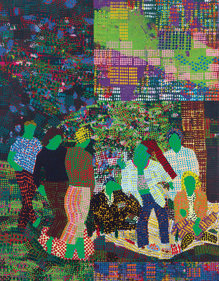
Ostergren’s recent paintings have a vibrant style that combines conceptual art strategies, histories of Impressionist painting, pharmaceutical branding, and tropes from leisure and wellness. Not unlike the artist John Baldessari who infused painting with conceptual art practices, Ostergren’s work operates within a self-created, continuous system that includes: stamping paintings with dots that match prescription pills; using colors and images from pharmaceutical ads; adroitly conflating leisure scenes from those ads with similar scenes from Impressionism; and reflecting on overlapping histories of pigments and pharmacology. Ostergren elaborates, “Every dot of paint is the specific size and shape of a certain pill and is the color that corresponds in some way to that drug, usually through the logo or the branding; but I don’t mix the paint to match, it is the closest I can get from the tube.” He adds that using paint from the tube connects to painting and pharmacology in the late 1800s, “If you were a painter during the era of Impressionism, you suddenly have options to buy paint in a tube and at the same time, people were able to go to a pharmacy and purchase manufactured drugs. It’s also interesting to me that the exact same chemical processes that produced new colors also yielded new drugs at that time, with some of the biggest pharmaceutical companies in the world beginning by making pigments.”
An exhibiting artist since receiving his MFA from Art Center College of Design in 2006, Ostergren’s undergraduate degree was not in art: “I think in addition to the conceptual artists that many of my grad school professors in California studied, some of the idea-driven nature of this work comes from studying anthropology and gender studies.” He adds, “At this point in my practice, I think the work has caught up with ideas I’ve had for a long time. I finally have found the right way to visualize concepts in a way that’s appealing on a visual level, but the paintings also perform what I’m trying to get
at conceptually.”
Thanks in part to Ostergren’s layered approach, the work is saturated, kinetic, and vibrant. This creates a colloidal state in the paintings—they are visually intriguing but never teeter into being decorative. The paintings include abstracted figurative scenes and abstract compositions reminiscent of structuralist films by Stan Brakhage and Paul Sharits (the latter of whom Ostergren cites as an influence). The dynamic color schemes of these paintings grab the viewer’s attention, but it’s their unpredictable and engaging compositions that invite longer exploration. Ostergren adds that sometimes leisure themes are gleaned simultaneously from pharmaceutical ads and Impressionist paintings. “In works like Le Déjeuner sur l’herbe (After Monet), I start with an existing art historical work for the composition (in this case, Claude Monet’s version of Luncheon on the Grass), and I replace Monet’s figures with renderings of people in contemporary pharmaceutical ads who share the same poses.”
Materially, powder from some drugs are mixed with their corresponding paint—allergy pills for instance often use some shade of green and depression medicine often uses blue in pharmaceutical advertising. Ostergren, consequently, is thinking not only about color combination but about symbolic vibrations the medicines might produce: “So that if I layer, for instance, pink or blue, that’s layering synthetic estrogen over testosterone. One creates a different kind of conceptual vibration of the drug interaction that’s happening along with the visual brain as it views color interaction.” He adds, “Like some advertising, I think I want the work to be a bit seductive but also a little bit repulsive, and hopefully that’s happening through the materials. There are certain kinds of things baked into the pharmaceutical in terms of color—including corporate logic and cultural associations—that I find fascinating and powerful to explore in the work. It’s useful for me to have that parameter because it produces another layer of meaning.”
On the horizon, Ostergren plans to continue experimenting with site-specific installations where his works are installed on top of wallpaper printed with the same pill dot patterns that inhabit his paintings, layering a new stratum of visual reverberation and conceptual meaning onto the work’s vibrational field.