Potent Venetian Red
Color can transport us to other times and places, such as glimpses into the Italian Renaissance. In the 15th century, the Medici family funded many artists: Michelangelo, da Vinci, Raphael, Botticelli, to name a few. Through their paintings we are given insight into the people and culture of that time. What strikes the viewer first and foremost are the deep, rich colors and mysterious shadows, evoking wealth or poverty, privilege or despair.
One of the most important colors used during the Italian Renaissance was Venetian red, especially in portraiture and drapery. Cennino Cennini recommended using Venetian red for the skin tones in nudes, by mixing two parts Venetian red with one part lime white. A dark shade of red, Venetian red gives us the rich draperies in El Greco, Caravaggio, and Titian. The colored dye was used by the British army for their uniforms, hence the name “Redcoats” during the American Revolution. The deep color was replaced by khaki during the 1890s.
Venetian red has been used in painting since prehistoric time, but the first time the color was named in English was in 1753. Before then, the color was called sinopia. The reddish color comes from hematite which was used as the underpainting on plaster in frescos. This was discovered when frescos were stripped from their wall for transfer and restoration.
This natural earth clay tinted with iron oxide was mined for centuries from a quarry near Venice, hence the name. The pigment has excellent tinting power as it is semi-opaque. The color has a lower chroma and is therefore less bright than other reds. When mixed with white, it has pinkish undertones. The color was found in the 17,000-year-old cave paintings of Lascaux, the Pompeii murals of Italy, and the Cappadocia cave chapels in Turkey.
Unlike cinnabar, another dark red pigment that contains mercury, Venetian red is nontoxic. Mixed with walnut oil, the red pigment takes on the deep lush color of brick buildings. Because rich people were the only ones that could afford bricks, early American settlers used the color to paint their buildings. Skimmed milk, lime, and red iron oxide were mixed to create an effective sealant against the harsh New England weather-hence the iconic red barn.
Indian and Vermilion red are close to the same hue as Venetian red. Vermilion red is scarlet red with minute portions of brown, which can be seen in red coral and the mineral cinnabar. Indian red owes its name to the color of the soil in India. Crayola Crayons used that color name, then changed to maroon, and now is called chestnut. In a special limited edition, this crayon color was named Vermont maple syrup.
One more color name to throw into the mix is Dragon’s Blood. The color comes from the wound-red resin from the Dracaena tree. The color isn’t used anymore because it takes a long time to dry and is darkened by light. We can find the Venetian red color in the head feathers of the male goldfinch, petals of the anemone, veinous blood, and in the depths of garnet. It is also the color of chocolate mixed with hyacinth red.
Jan van Eyck’s Portrait of a Man, 1433, used the color for the man’s headdress, with thin washes of red lake pigment applied as a glaze over vermillion. The astounding result is Venetian red as a symbol of high rank. Piero della Francesca used Venetian red sparingly for the Madonna’s underclothing, contrasting the striking array of blues in his The Nativity, 1472–74.
Matisse saturated his canvas with potent Venetian red in his 1911 painting, The Red Studio. The diagrammatic sketches delineating the table, chair and bureau are actually lines without paint, revealing the bare canvas beneath. Indian-born artist Anish Kapoor collaborated with author Salman Rushdie for the exhibition, Blood Relations, at London’s Royal Academy in 2007. His sculpture, Svayambh, Sanskrit for self-creation, consists of a solid block of wax and oil-based paint, creating a liquid trail of Venetian red. As Kapoor said, color is a construct to “create mythologies.”
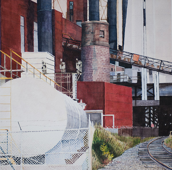
Mark Nielsen in Red White and Blue (pictured) uses Venetian red in combination with burnt sienna to depict the brick walls of the Shiller wood burning plant in Portsmouth, NH. Using the rich watercolor, Nielsen said, “I rarely use a color without mixing other colors to catch the quality of light and to develop the texture of the buildings.”
Color and light. As Goethe wrote, “Color and light, it is true, stand in the most intimate relation to each other.” The degree to which light is emitted and reflected is what creates color. Color is how we see, through light and shadow and deep thought. Color is story.