Supernatural Blue
“I am seeking for blue all the time.” —Vincent Van Gogh
When we think of the sky and the sea, we tend to think of the color blue. But what color is the sky and what color is the sea, really? Describing anything in the natural world is nearly impossible as so much depends on light and shadow, texture and material, and what is next to or behind it. This makes landscape painting difficult, and painting a portrait whose subject has blue eyes. Which blue to use? Most paint manufacturers like Blick or Winsor Newton typically offer around 20 different blues. Mixing these hues together is what the natural world does—and most artists—do. There are between 225 and 260 shades of blue and more being invented all the time.
Joan Mitchell’s Les Bleuets (The Cornflowers), 1973, is indicative of her love for the color and her rich blending of many different blues. This monumental oil painting, 110 3⁄8 x 229 ½ inches, drips with layered Prussian, cerulean, ultramarine, cobalt blue amidst pale yellows and pinks, and warm whites. It’s like a primer for the color blue, offering to the viewer an exposé of what blue is up to, which is continually swimming in change.
In 1956, after a year of experiments with a chemist, Yves Klein found what he said was “the most perfect expression of blue.” Yves Klein blue; “International Klein Blue.” He wanted a brilliant, saturated, all-pervasive ultramarine which gave a visual sensation of complete immersion in the color. “To sense the soul, without explanation, without words, and to depict this sensation—this, I believe, is what led me to monochromatic painting,” Klein once said. Ultramarine means “beyond the sea.”
We even sing the blues. There’s a blues scale in music that refers to notes that are sung in a slightly higher or lower pitch than is standard, called blue notes. Think Sarah Vaughan singing “When Sunny Gets Blue,” sliding around like the dripping blues in Mitchell’s Les Bleuets. These blues are creamy, melting, languorous, seductive. They slip under and over, never quite hitting smack in the middle. “You ain’t never been blue, till you’ve got that mood
indigo” Duke Ellington’s jazz standard.
The luscious cyan-blue print in a cyanotype is used in art for monochrome imagery. Accidently discovered in 1842, cyanotype is a method of photographic printing that is slow-reacting and economical for photographers. Another process of cyanotype is in blueprints in the luminous lightfast and stable Prussian or Turnbull blue color.
An earlier accident producing blue was in 1704, in Berlin, when a chemist mixed into cochineal red (insect blood) a measure of potash that was contaminated with animal blood. And voilà–Prussian Blue. Watteau used the color in 1710, and soon the demand spread throughout Europe into a commercial pigment, which was eventually used for postage stamps, flags, tea, and became the official color of the Prussian army uniforms. Gainsborough used it in his luminous portraits. In 1830, Hokusai used Prussian blue mixed with indigo in his famous Great Wave off Kanagawa. Van Gogh’s Starry Night, 1889, also used swirls of Prussian blue.
Blue is the rarest of colors because there is no naturally occurring true blue pigment in the natural world, only tiny flecks in flowers and birds. Even Nabokov’s blue morpho butterflies are really, as he described, “shimmering light-blue mirrors.” This is because the wings are covered with miniature scales whose angle bends light so that only the blue part of the light spectrum is reflected to our eyes. Bees are attracted to “bees purple,” a color that combines yellow and ultraviolet light that is outside the range of human vision. And a flower’s color is most intense when the pollen is ready for release. Delicious and life-sustaining.
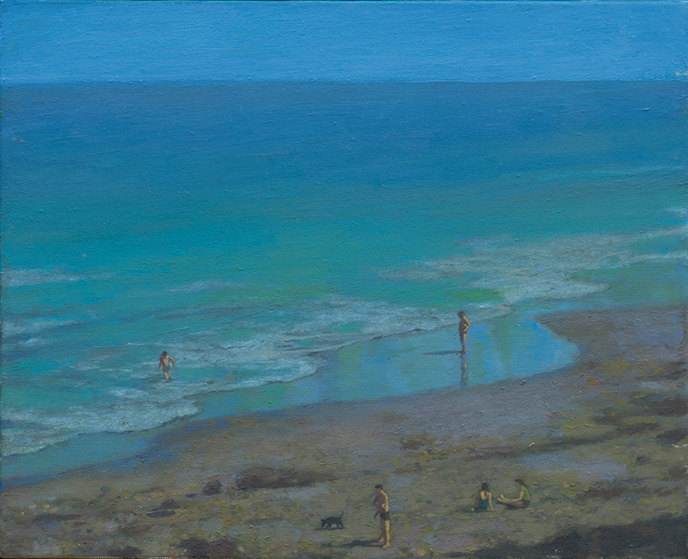
Santa Cruz Landscape, by Gillian Pederson Krag, (pictured), is a powerful proclamation of blue. Krag saturates her ocean in many different blues, revealing the shallow shoreline and deepening gradually into the vast ocean. She said, “Color requires an emotional engagement; drawing can be understood but color must be felt. And while it is possible to be motivated to learn to draw from a sense of duty or responsibility, color is only available to those who manage, in some way or another, to love it and approach it with their feelings…it wasn’t until I first saw Bonnard’s work that I realized what color in painting was and could be.”
We can clearly see that in Bonnard’s Dead End (also known as The Lane (Le Cannet)), oil on canvas, 1925. The boy dressed in blue, a blue wall of the house, the blue sky is contrasted with a rust-colored door, splash of yellow in the upper left, the ochre ground, and deep green trees. A colorist of the first order.
Scotch blue is the color of the throat of a blue titmouse, the stamina of single purple anemone, and blue copper ore. Prussian Blue is the color of the beauty spot on the wing of a mallard duck. Ultramarine Blue is the upper side wing of the small blue Heath butterfly, the borage flower, and lapis lazuli or azure stone. These blues are slender lines, translucent, precious jewels. Kandinsky wrote: “The deeper the blue becomes, the more strongly it calls us towards the infinite, awakening a desire for the pure and, finally, for the supernatural.”
There are blue colors named after flowers, minerals, birds, painters. No wonder blue is for so many people their favorite color—we can live inside it happily. We take vacations where the skies are blue and daydream while floating on a deep blue sea. Blue is even mentioned in the Bible 49 times; known as “biblical blue,” tekhelet in Hebrew. 2000 years later we still don’t know what it looked like or how it could be recreated. Blue is elusive. Perhaps that’s why it has at least 260 different names.